BIGPAY E-Wallet Design: Redesigning the In-App Homepage
Ardavan Hp
Executive Summary
This case study examines the redesign of the in-app homepage for BigPay, a mobile payment app under the AirAsia group. The goal was to enhance UI/UX by addressing limitations in the original design, improving functionality visibility, and fostering user trust. The result is a cleaner, more intuitive homepage that highlights key functionalities, optimizes information hierarchy, and improves user satisfaction.
Introduction
As a Senior UI/UX Designer, I was tasked with redesigning the in-app homepage of BigPay. Despite initial success and endorsement by Tony Fernandes, BigPay faced user engagement challenges due to an outdated homepage that lacked intuitive access to main functionalities.
Project Overview
BigPay aims to provide an alternative to traditional banking by offering convenient, secure financial services in Malaysia— from buying gold and tracking spot prices to leveraging the AirAsia brand’s trust. The objective: redesign the in-app homepage to improve user engagement, highlight key features, and reinforce user confidence.
Assessment of Original Design
Initially praised for its clean layout, the original BigPay homepage struggled with:
- Outdated Aesthetic: The design felt slightly old and did not align with modern UI trends.
- Limited Functionality Visibility: Key actions like PAY, REQUEST, TOP UP, REWARD POINTS were not prominently displayed.
- Cluttered Information: Homepage lacked clarity, causing confusion and hindering navigation.
Design Considerations
Key focus areas in the redesign:
- Minimalist Aesthetic: Build confidence and trust.
- Optimized Information Hierarchy: Restructure layout to highlight core functionalities first.
- Functionality Prioritization: Immediately accessible PAY, REQUEST, TOP UP, REWARD POINTS.
- Enhanced User Flow: Reduce friction for main tasks.
- Visual Appeal: Elegant design that accommodates more options without overwhelming the user.

Solution Implementation
By emphasizing simplicity and user-centric features, the following solutions were adopted:
1. Clean & Elegant Design
Adopted a minimalistic approach for an elegant, professional look. Balanced color palette to boost user trust.
2. Enhanced Information Hierarchy
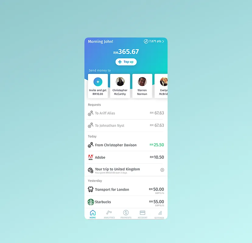
Reorganized the homepage to prioritize key functionalities (PAY, REQUEST, TOP UP, REWARD POINTS) below the wallet balance for immediate access.
3. Streamlined Sections
- Requests: Moved user requests off the homepage to a dedicated section.
- Friends List: Moved below main options with a new search feature.
- Invitation Incentives: Moved RM10 reward info to a follow-up page, reducing main screen clutter.
4. Transaction History Optimization
Introduced a calendar-based navigation for transaction history, plus a search option for quick filtering by merchant or category, removing unnecessary icons for a more open layout.

Outcomes
The redesigned homepage resulted in:
- Improved User Retention: ~25% increase in retention due to easier navigation.
- Increased Functionality Usage: Main features saw a 30% uptick from prominent placement.
- Positive Feedback: Users praised the cleaner design and direct access to essential tasks.
- Enhanced Trust & Credibility: Minimalist, polished UI reinforced BigPay as a reliable alternative.
Conclusion
The BigPay homepage redesign tackled initial design limitations by elevating key functionalities, refining information hierarchy, and introducing a clean, modern aesthetic. The changes not only boosted user engagement and retention but also positioned BigPay as a reliable, user-centric financial service. This case underscores how strategic UI/UX enhancements can significantly bolster a mobile app’s success.

