Introduction
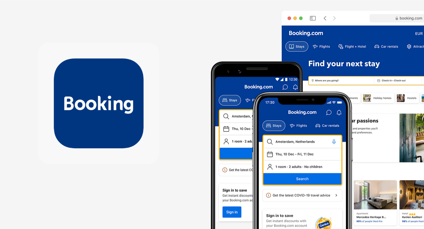
Booking.com is a global leader in online travel bookings, offering a comprehensive range of services including hotel reservations, flight tickets, car rentals, cruises, attractions, and tours. Despite its extensive offerings, Booking.com identified a significant challenge: users tend to focus primarily on their main booking (such as hotels or flights) and rarely explore additional services available on the platform.
As a freelance UX designer, I was approached by Booking.com to address this issue. This case study outlines the project undertaken to enhance user engagement with Booking.com's additional features post-primary booking. It covers the problem identification, research insights, design solution proposed, user testing conducted, and the reception of the solution by Booking.com.
Problem Statement
Challenge: After completing a primary booking (hotel or flight), users on Booking.com exhibit low engagement with additional services, leading to missed cross-selling opportunities and a fragmented user experience.
Impact:
- Revenue Potential: Untapped ancillary services
- User Experience: Users miss out on a one-stop-shop convenience
- Brand Perception: Limited engagement diminishes perceived comprehensiveness of the platform
Research & Insights
User Behavior Analysis: Data revealed a significant percentage of users exiting after completing their primary booking, with minimal exploration of other services.
User Surveys & Interviews: Surveys with a diverse SE Asian user base indicated:
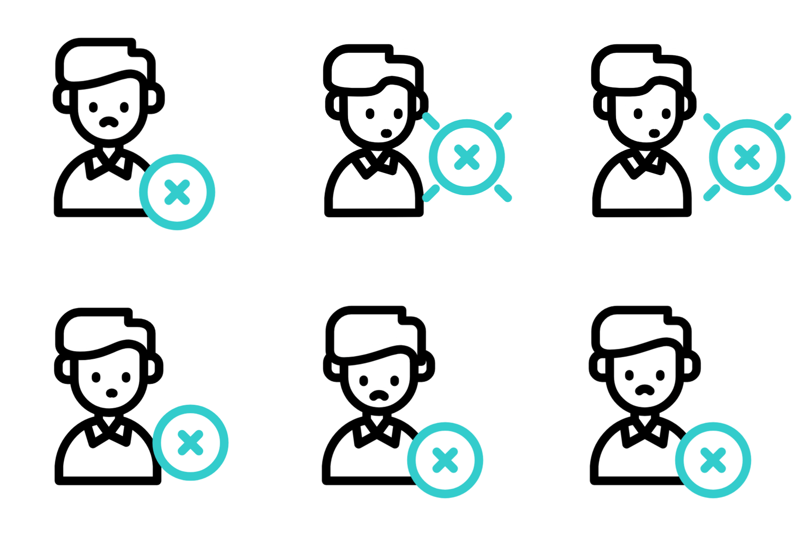
- Overwhelm: Too many options presented simultaneously
- Lack of Awareness: Users unaware of the full service spectrum
- Time Constraints: Preference for a streamlined booking process without extra prompts
Ideation & Concept: Progress Bar
Through our brainstorming, we recognized the need for a subtle prompt that encourages users to explore additional services without disrupting their primary flow. This led to the creation of a Progress Bar: a simple, visually engaging way to guide users through essential steps, highlighting extra travel options (like tours or car rentals) once the main booking is nearly complete.
UX Reasoning: The progress bar taps into users’ preference for completion and achievement, gently nudging them to review other services without feeling forced or overwhelmed. By monitoring user progress, we can strategically reveal relevant offerings at the right moments to encourage exploration.
Ideation & Concept: Mascot Character
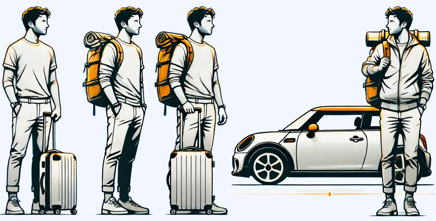
In parallel with the progress bar, we introduced a Mascot Character to add a sense of personality and guidance. This friendly traveler evolves alongside the user’s journey, visually indicating how they can enhance their trip with additional services—like picking up a rental car or booking a local tour.
UX Reasoning: The mascot provides a playful, humanized element to what could otherwise be a transactional flow. By personifying the user's progress, it quietly reinforces available options (e.g., “Need transport?” or “Curious about nearby events?”), building a more engaging experience without overwhelming them.
Conclusion
The UX project effectively tackled low engagement with Booking.com’s ancillary services by introducing a progress bar and a friendly mascot. Tests indicated ~45% user engagement when gently guided.
Though not yet implemented, Booking.com’s positive reception highlights the potential of user-centric design in unlocking additional revenue streams and enhancing user satisfaction.
