Building Trust and Retention for an Advanced Fintech Application
By Ardavan Hp
Executive Summary
Eduloco’s platform faced key UX issues, including inconsistent colors, cluttered UI, and poor responsiveness. The audit recommended simplifying the color palette, standardizing design components, and adding gamification to improve engagement. The final web app, refined through iterative testing, now offers a streamlined, user-friendly experience that caters to its Middle Eastern and African student audience. The result is a cohesive, engaging platform that enhances usability and trust.

UX Audit & Findings
Eduloco’s initial platform faced numerous challenges:
- Visual Design: Logo and color palette were adequate, but recommended to simplify color usage to mirror Edvoy’s clean style.
- Accessibility: Inconsistent color schemes created confusion and an unprofessional look. A consistent palette was advised.
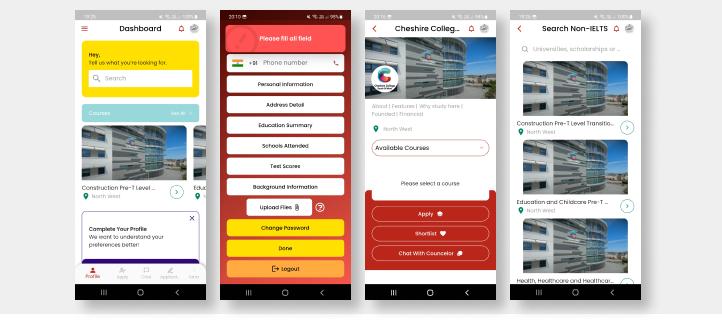
- UI Assessment: Oversized popups/dropdowns, inconsistent page designs, and improper spacing led to confusion and lost interactions.
- Responsiveness & UX: Inconsistent design patterns and CTAs harmed user trust. Missing gamification (e.g., progress bars) reduced engagement in completing lengthy forms.
In summary, the UX audit called for simpler color schemes, consistent design patterns, standardized spacing, and gamification to boost engagement and overall user satisfaction.

From Android to Web: Eduloco’s UI/UX Transformation
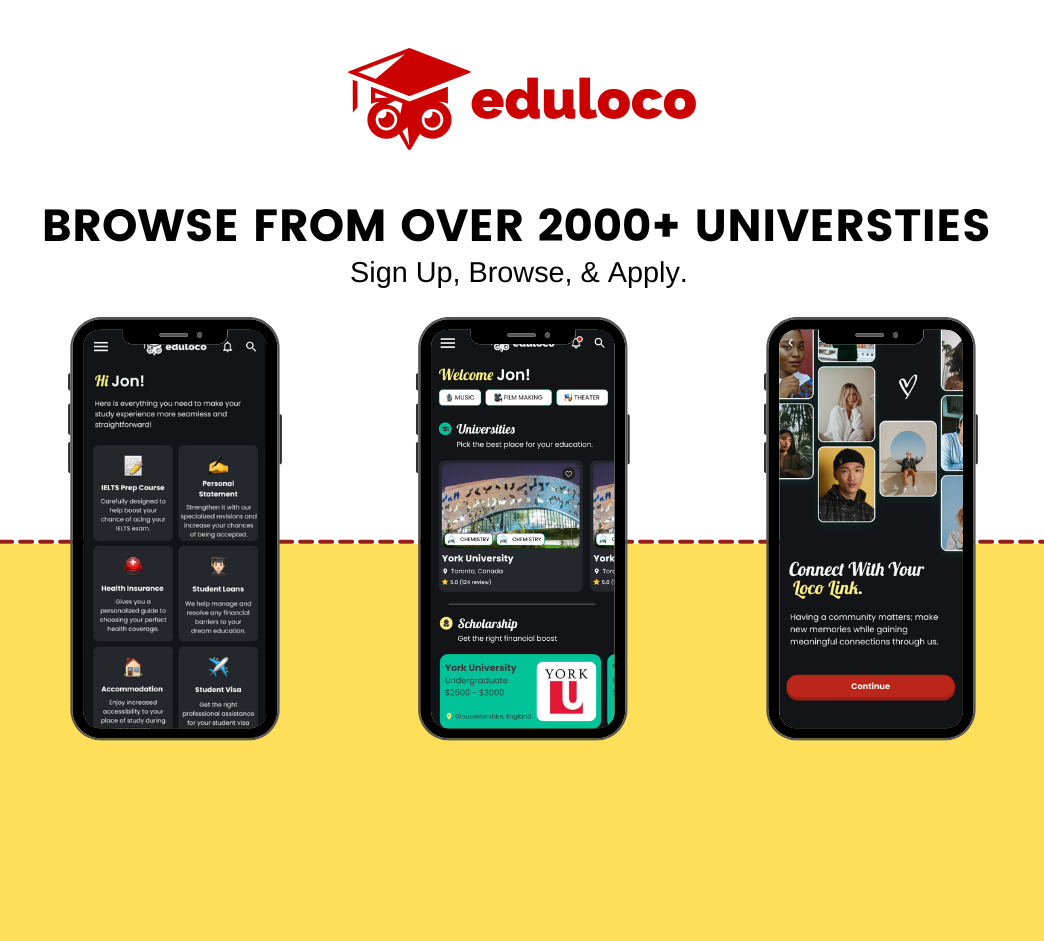
Initially launched on Android without a cohesive art direction or USP, Eduloco’s product objectives evolved while navigating the Antler Startup Accelerator. The challenge was to design a versatile, adaptive web application that served an audience aged 20+ from Middle Eastern and African backgrounds, seeking educational opportunities abroad.
Key Outcomes:
- Home - Eduloco: A streamlined homepage presenting essential services and features.
- Figma Link & UI Design: Prototypes refined to align with new brand identity and user flows.
- Testing & UX: Iterative testing ensured the final web app catered to the evolving needs of Eduloco’s diverse audience.
%20(1).gif)
Outcomes
Deep UX Analysis: Provided a clear outline of Eduloco’s flaws, including inconsistent colors, unoptimized component spacing, and missed engagement opportunities.
Plan of Action: Delivered a roadmap for simplifying the color scheme, improving design consistency, and incorporating gamification elements to keep users motivated while completing tasks.
Seamless Web Application: The final Eduloco web app caters to an evolving target audience, boasting improved UI aesthetics, consistent design patterns, and a more engaging user experience.
Conclusion
By conducting a thorough UX audit and applying user-centric UI design principles, Eduloco evolved from an unfocused Android app to a polished web platform. Simplifying the color palette, unifying design components, and introducing progress-based gamification led to a more engaging, accessible, and cohesive experience for Eduloco’s audience. The end result is a revitalized web application that meets the needs of students seeking educational opportunities abroad—fostering trust, clarity, and usability throughout.
%20(1).gif)