Responsible fintech · UX/UI + service design
Wallex Guard.
I redesigned the decision around trading credit so a user can understand the downside, compare plans on equal terms, and act before liquidation—not after it.
Independent, unsolicited concept
Public evidence
Design hypotheses
CompareOne visual grammar
SimulatePersonal downside
ActBefore liquidation
LearnTransparent receipt
13:13● ●●
پایدار
سلامت حساب اعتبار
فاصله تقریبی تا هشدار
12%
اقدام زودهنگام، گزینههای بیشتری حفظ میکند
بازپرداخت۱۰۳٫۶ م.
روز باقیمانده۲۲ روز
سود / زیان−3.1%
دارایی آزاد۴٫۲ م.
توجهاگر بازار ۵٪ افت کند
ارزش تقریبی دارایی شما۰٫۹ میلیون
Research integrity
This is a portfolio concept based on information available without an authenticated Wallex account. I did not conduct interviews with Wallex customers or access internal analytics. I separate observed evidence, my interpretation and proposed research throughout the case study rather than presenting invented participants or outcomes.
01 · Executive summary
The product is powerful. The decision needs to be legible.
Wallex publicly presents an extensive exchange ecosystem: hundreds of markets, instant trading, automated tools and trading credit. That breadth signals maturity, but it also increases the number and consequence of decisions a user must make.
I focused on one moment with unusually high stakes: choosing and managing trading credit. My premise is simple—friction should rise with financial consequence. The redesign does not hide the product or discourage experienced traders. It makes cost, leverage, loss and exit equally visible before commitment.
How might Wallex help an eligible user explain the downside in their own words before they activate leverage?My design question—not a claim about Wallex’s internal strategy
02 · Evidence stack
What I know, what I infer, and what still needs research.
The case study is intentionally explicit about evidence quality. Public pages are useful for auditing information architecture and disclosed product rules. Store reviews reveal recurring topics, not representative prevalence. Behaviour, motivation and business impact require first-party research.
Verified: directly observed
Inferred: design interpretation
Proposed: requires validation
Plans expose amount, input, duration and repayment.
Public listings include materially different amounts, durations and input requirements. A 100 million toman plan, for example, lists a 10 million input and 103.6 million repayment after 30 days.
Public trading-credit page [2]Liquidation can mean no assets are returned.
The FAQ explains warning notifications and actions users may take, then states that continued decline can trigger immediate sale and that no asset or amount returns after liquidation.
Public trading-credit FAQ [2]Consequence arrives later than the invitation to activate.
The plan list foregrounds value and activation while the strongest downside is explained in supporting FAQ content. I treat this as an information hierarchy opportunity, not proof that users misunderstand it.
Heuristic/content audit of the public pageTrust is operational, not only visual.
Public app-store summaries and reviews mention ease of transfer, asset variety and support positively, alongside recurring concerns about transaction speed, price display, withdrawals, fees and support response.
Myket and Cafe Bazaar listings [3] [4]Users need a next action, not another status.
In high-volatility moments, a red warning without a concrete path can increase anxiety. My concept pairs every risk state with an action, expected effect and route to human support.
Service-design hypothesisComprehension should become a product metric.
I would test whether users can identify repayment, compare leverage, explain liquidation and choose a risk-reducing action before measuring activation as a success.
Validation protocol in section 0803 · Diagnosis
The gap is not features. It is decision architecture.
The current public experience is built around product capability. I reframed it around the user’s changing mental state—from curiosity, to comparison, to commitment, to pressure. That exposes four places where the interface can carry more of the cognitive work.
Feature-first entry
Trading, bots, credit, staking, wallets and promotional content compete for attention. A user must first decide which tool is appropriate before the system learns their intent.
Non-normalized comparison
Amount, collateral, repayment, duration and currency vary. The user must mentally derive effective leverage and relative cost across plans.
Abstract downside
“Liquidation” is a domain term. It becomes understandable when translated into the user’s own starting capital, an adverse move and the amount potentially remaining.
Status without resolution
A warning is only useful when it explains what changed, how urgent it is, and which action is available now.
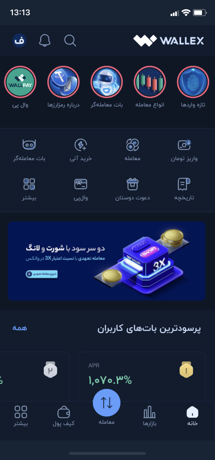
Abundance creates a hidden onboarding task.
The dashboard offers many valuable modules at once. For experienced users that can feel efficient. For a newer user it shifts prioritisation to the customer: “Which of these is safe or relevant for me?”
The interface and support system are one experience.
When deposits, withdrawals, alerts or account restrictions become uncertain, the user does not distinguish frontstage UI from backstage operations. Status language, response times and escalation routes all shape trust.
04 · Service journey
A six-stage journey from intent to learning.
I treated trading credit as a service that begins before activation and continues after closure. The redesign connects the product interface, risk engine, notifications, support and transaction receipt around one promise: the user should always know their exposure and next available action.
State the goal
Short-term trade, hedging or exploration; experience and acceptable loss.
Compare equally
Leverage, total repayment, daily cost, duration and downside in one grammar.
Simulate loss
Translate a market move into personal equity and proximity to warning.
Confirm meaning
Brief comprehension check and explicit repayment acknowledgement.
Monitor and act
Risk health, what changed, urgency and the effect of each action.
Close and learn
Transparent receipt showing input, P/L, credit cost and final return.
| Layer | Discover | Compare | Activate | Monitor | Exit |
|---|---|---|---|---|---|
| User question | Is this for me? | Which plan is actually safer? | Do I understand the commitment? | Am I still in control? | What did this cost me? |
| Frontstage | Goal and experience prompt | Normalized plan cards + scenarios | Review, comprehension and consent | Health meter, alert and action sheet | Close flow + readable receipt |
| Backstage | Eligibility and suitability rules | Live plan, fee and risk data | Account creation + audit trail | Risk engine + notification service | Settlement + statement generation |
| Current risk | Capability can precede orientation | Mental arithmetic across plans | Legal text can become ritual | Urgency without resolution | Outcome spread across records |
| Design opportunity | Intent-led entry | Comparable decision objects | Meaningful confirmation | Action-effect feedback | Learning loop |
05 · Principles
Six rules kept the concept honest.
The principles are deliberately stricter than a conventional conversion funnel. They use human-centred design, error prevention and fair digital-design guidance as benchmarks. They are not claims about which regulations legally apply to Wallex in Iran.
01
Consequence before commitment
Show loss, repayment and liquidation beside activation—not only in a later help article.
Positive friction · fair choice architecture02
Normalize every plan
Keep the comparison grammar stable even when currency, duration and amount change.
Recognition over calculation03
Personalize the downside
Convert percentages into the user’s own equity, then show the assumptions behind the estimate.
Risk salience · transparency04
Pair status with action
Every alert answers: what happened, how urgent is it, what can I do, and what may that change?
Feedback · recovery · control05
Do not gamify exposure
A confident interface must not imply a confident outcome. Avoid celebration, streaks or urgency around leverage.
Responsible finance benchmark [9]06
Measure decision quality
Activation is healthy only when users understand cost and can respond to risk after activation.
Outcome over funnel velocity06 · Interactive concept
Turn leverage into a personal scenario.
A percentage is easy to acknowledge and hard to feel. The simulator uses a publicly listed plan structure, then demonstrates how a market movement changes the remaining equity after repayment. It is an educational model—not Wallex’s real liquidation engine.
What happens to my own money if the market moves?
Illustrative only. A production version must use live fees, asset rules, warning thresholds, slippage and the contractual risk engine.
Market movement
−3.0%
Drag the scenario from −15% to +10%
−15%0%+10%
Your input10,000,000 TMN
Trading credit100,000,000 TMN
Total position110,000,000 TMN
Repayment103,600,000 TMN
Estimated remaining equity
3.10M
69% below your initial input
High sensitivity
A small market move removes most of your cushion.
At this illustrative level, a −3% move leaves roughly 3.1 million toman after the listed repayment.
More cushionApprox. zero-equity at −5.8%
07 · Key screens
The design carries the same promise through the entire service.
The interface is intentionally calm. Risk is signalled with text, shape and hierarchy—not colour alone. Persian content is right-to-left while amounts, percentages and tickers remain isolated left-to-right to prevent bidi errors.
13:13● ●●
راهنما
طرح مناسب را مقایسه کنید
تمام طرحها با معیارهای یکسان نمایش داده میشوند.
ریسک بالا۱۰۰ میلیون تومان
دارایی شما۱۰ م.
اهرم موثر11×
بازپرداخت۱۰۳٫۶ م.
مدت۳۰ روز
ریسک متوسط۲۵ میلیون تومان
اهرم موثر6×
01 · Compare
Normalized plans
Amount, leverage, duration, repayment and risk remain in fixed positions.
13:13● ●●
مرحله ۲ از ۴
شبیهساز ریسک
اگر بازار ۵٪ افت کند چه میشود؟
ارزش تقریبی دارایی شما
۰٫۹ میلیون
۹۱٪ کاهش نسبت به دارایی اولیهنزدیک هشداروضعیت سناریو
حتی افت کوچک بازار میتواند بخش بزرگی از دارایی اولیه شما را از بین ببرد.
02 · Simulate
Personal downside
The user sees the effect on their starting capital before activation.
13:13● ●●
مرحله ۳ از ۴
تایید آگاهی
هدف جلوگیری از خطاهای پرهزینه است، نه یک آزمون نمایشی.
✓میدانم اعتبار معامله بدون ریسک نیست.
✓در صورت لیکویید شدن ممکن است مبلغی بازنگردد.
سوال کوتاه
کدام اقدام میتواند فاصله تا هشدار را بیشتر کند؟
کاهش موقعیت03 · Confirm
Comprehension, not legal theatre
A concise check confirms meaning without burying the user in text.
13:13● ●●
پایدار
اعتبار فعال
فاصله تقریبی تا هشدار
12%
بازپرداخت۱۰۳٫۶ م.
روز باقیمانده۲۲
سود/زیان−3.1%
دارایی آزاد۴٫۲ م.
04 · Monitor
Account health
The home state prioritizes exposure and available risk-reducing actions.
13:13● ●●
اولویت بالا
هشدار ریسک
حساب شما به محدوده هشدار نزدیک شده
قیمت دارایی اصلی در ۲ ساعت گذشته ۴٫۸٪ کاهش یافته است.
اقدام پیشنهادی
کاهش ۳۰٪ از موقعیت
میتواند فاصله تقریبی تا هشدار را افزایش دهد.
05 · Recover
Actionable alert
The message explains the trigger, urgency and probable effect of each response.
13:13● ●●
تکمیل شد
طرح بسته شد
بازگشت به حساب اصلی
۷٫۴ میلیون
دارایی اولیه۱۰ م.
سود/زیان معامله−1.5M
هزینه اعتبار−1.1M
مبلغ نهایی۷٫۴ م.
06 · Learn
Transparent exit receipt
The outcome closes the loop between the original decision and final return.
08 · Standards + culture
Global principles, localized for an Iranian financial product.
I used standards as design constraints, not decoration. International finance guidance is included as comparative good practice—not asserted Iranian law. Localization goes beyond translation: directionality, numeral handling, currency ambiguity, bandwidth, device constraints and the local trust model all affect the experience.
WCAG
2.2 AA
2.2 AA
Error prevention and operable controls
Large touch targets, visible focus, no colour-only risk state, consistent help, and explicit review before a high-consequence financial commitment.
W3C accessibility benchmark [5]ISO
9241
9241
Human-centred process and interaction principles
Design around tasks, context and stakeholder impacts; preserve suitability, controllability, learnability and error tolerance across the service lifecycle.
ISO 9241-210 and 9241-110 [6]FAIR
DESIGN
DESIGN
Positive friction over speed at any cost
Clear language, visible steps, visual explanations and testing for good outcomes. The regulator source is a benchmark for responsible design, not a legal claim about Wallex.
FCA digital-design good practice [7]RTL
+ BIDI
+ BIDI
Direction is structural
Use semantic dir="rtl", logical CSS properties and isolated LTR tokens for tickers, percentages and account identifiers—rather than manually reversing layouts.
TMN
≠ IRR
≠ IRR
Make the money unit unambiguous
State “toman” in labels and receipts, format long amounts consistently, and never rely on a trailing zero convention the user must remember.
Localization requirement for Iranian usersLOW
STRESS
STRESS
Design for volatile moments
Use plain Persian, restrained motion, persistent support access and calm hierarchy. Alerts should reduce ambiguity rather than amplify urgency.
Cognitive-load and service-recovery principle09 · Validation plan
The study I would run before shipping.
This protocol is proposed, not completed. It is detailed enough to hand to a researcher, but it deliberately contains no invented interview quotes, participant counts or “results.” After real fieldwork, this section should be replaced with recruitment, raw evidence, findings and design changes.
Study status: proposedNo participant data claimed
Recruit across experience
Planned sample: 18 participants—six new, six intermediate and six high-frequency traders. Include users who have and have not used credit products.
Test real decisions
Compare two plans, identify total repayment, predict a 5% decline, explain liquidation in their own words, then respond to a warning.
Set thresholds first
At least 15 of 18 correctly identify the riskier plan; at least 16 identify repayment; no participant activates while believing principal is protected.
Triangulate backstage data
Pair sessions with support intents, warning-to-action time, early liquidation, repeated plan use and complaints. Interview frontline support agents.
“Many users wanted transparency.”
- No recruitment criteria
- No method or artefacts
- No conflicting evidence
- No trace from finding to design
Show who, how, what changed and where uncertainty remains.
- Recruitment and exclusions
- Task script and success criteria
- Evidence table with severity
- Design iteration linked to findings
10 · Measurement
Success is informed activation—not activation alone.
A responsible metric system allows conversion to fall when low-comprehension activations are removed. The business question is whether better decisions improve healthy use, reduce avoidable losses and support load, and increase durable trust.
Informed activation rate
Eligible users who view a downside scenario, demonstrate comprehension and still activate a plan appropriate to their stated tolerance.
7-day liquidation rate
Segment by first-time use, experience, leverage and plan.
Comparison accuracy
Can users identify total cost and the riskier plan in under one minute?
Contacts per activation
Especially repayment, warning, liquidation and exit questions.
Warning response time
Time from high-risk alert to a meaningful protective action.
Validate meaning
- Moderated comparison tasks
- Persian risk-language testing
- Support-agent workshops
- Risk/legal review
Ship the decision layer
- Normalized plan cards
- Scenario preview
- Comprehension review
- Analytics instrumentation
Close the service loop
- Live health model
- Action-effect estimates
- Alert orchestration
- Exit receipt and education
11 · Reflection
The most senior design decision was choosing what not to claim.
Without internal data, I cannot know whether users misunderstand the product, which plan is most profitable, how the liquidation engine behaves, or whether the proposed friction improves outcomes. I can show a reasoned hypothesis, make assumptions visible, build a coherent service concept and specify the evidence needed to decide.
That makes the project stronger—not smaller. Product design is as much about the quality of the question and the integrity of the evidence as the polish of the interface.
Source notes
Public references used.
Accessed July 2026. Public product details can change. International standards and regulatory material are used as design benchmarks; they do not establish Wallex’s legal obligations.
01Wallex public homepage and feature overviewOfficial
02Wallex trading-credit plans and liquidation FAQOfficial
03Wallex app listing, review themes and rating on MyketMarketplace
04Wallex app listing and public ratings on Cafe BazaarMarketplace
05Web Content Accessibility Guidelines 2.2Standard
06ISO 9241-210 human-centred design; paired with ISO 9241-110Standard
07FCA good and poor practice for digital customer journeysBenchmark
08W3C guidance for structural RTL and bidirectional textGuidance
09FCA experiment on digital engagement practices in trading appsResearch