01 / Starting point
The product was changing platforms and direction.
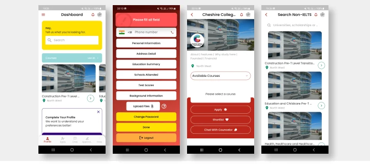
Eduloco’s objectives evolved during its time in the Antler Startup Accelerator. The early Android app lacked a cohesive visual direction; the next task was to shape an adaptable web experience.
The original audience was adults aged 20 and above from Middle Eastern and African backgrounds seeking education abroad. The design needed to connect educational information with a longer application journey.
02 / Audit to direction
The audit gave the redesign a concrete starting point.
The recurring issues were specific: inconsistent colours and page patterns, oversized popups and dropdowns, uneven spacing and unclear calls to action.
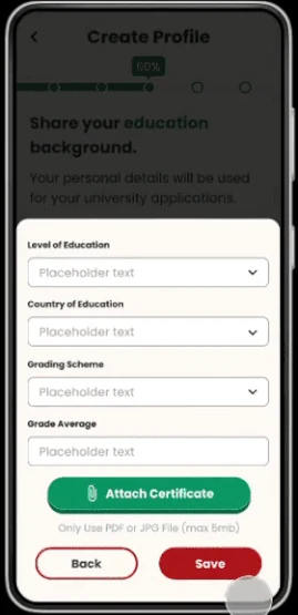
The recommendations were to simplify the palette, standardize repeated components and make the next step easier to recognize. Progress indicators were proposed for the longer forms.
Visual consistency
Use a common treatment for navigation, repeated controls and spacing across the journey.
Application progress
Make the remaining work visible instead of asking users to infer the length of a form.
03 / Design evidence
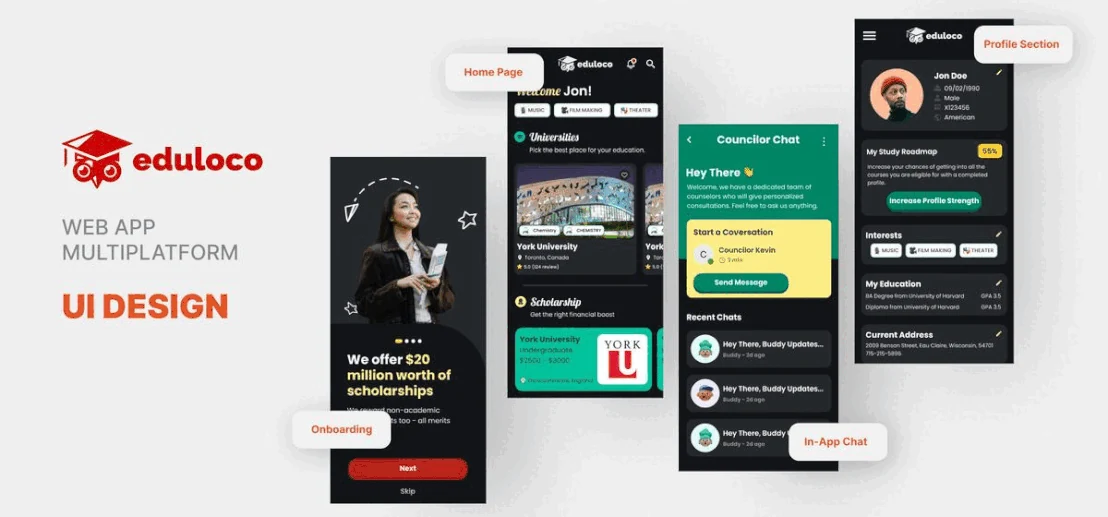
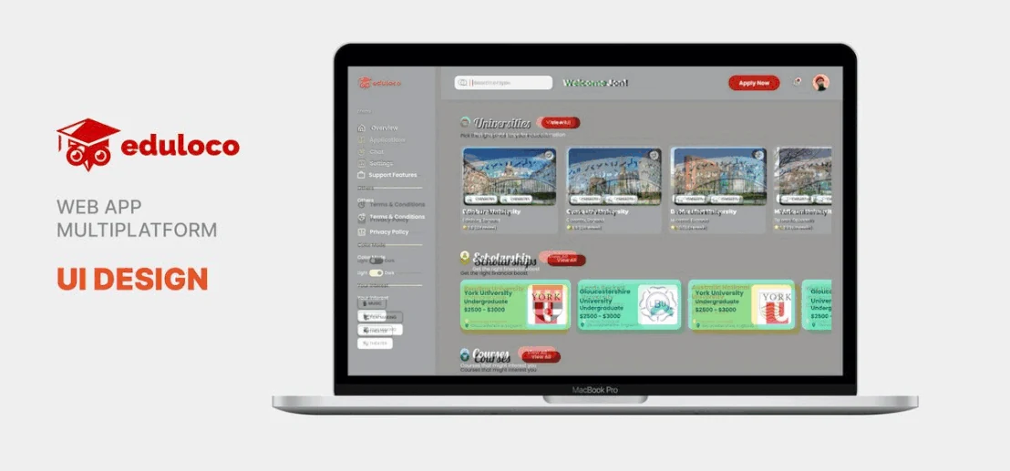
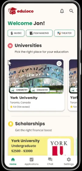
A common language across mobile and web.
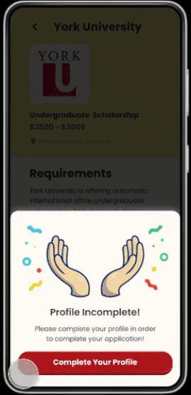
The design direction brought profile, navigation and education content into a more consistent treatment. The original presentations below show both the broad direction and the smaller moments within it.
04 / Contribution
From a list of inconsistencies to a design direction.
The audit and interface work belong to the same story: identify repeated problems, define a common language and apply it across the product’s key journeys.
The deliverables were UX audit recommendations and mobile/web interface designs. The important design constraint was to establish consistency while the product itself was evolving.
Next project